
Wine Club
This Toronto-based monthly service founded in February of 2020 offers a curation of low-intervention wines. Each month, subscribers receive a selection of four wines chosen around changing themes as well as wonderfully written tasting notes and additional information about each bottle.
The creators work under a mantra of simplicity, bringing this product into a more approachable realm for their customers and wanted a design package to match. Fun, light and straight to the point.

Unboxed June 2020 wine line-up (left, photo by: @foodiefork) - Promotional sticker pack (top right) - Alternate logo/colour scheme (bottom right)

Colour palette and design element samples (left) - Spot illustration for social media post expanding on a specific method of wine making (top middle) - Simplified logo header for email and administrative purposes (bottom middle) - Social media profile feed featuring branded content (right)

Branded photo for May 2021 pack (photo by: @doahmalloy)

Rapture Vintage
This independent buyer and seller of vintage clothing and jewelry is based out of Vancouver and has recently expanded her practice to include her own handiwork and the rejuvenation of previously loved pieces. While she continues to curate and sell quality articles, the incorporation of giving new life to items which otherwise might be overlooked deserved a new visual identity.
The main goal with this project was to create a set of logos which could be regularly altered with different patterns and colour schemes to reflect the multifaceted nature of the business and the product.

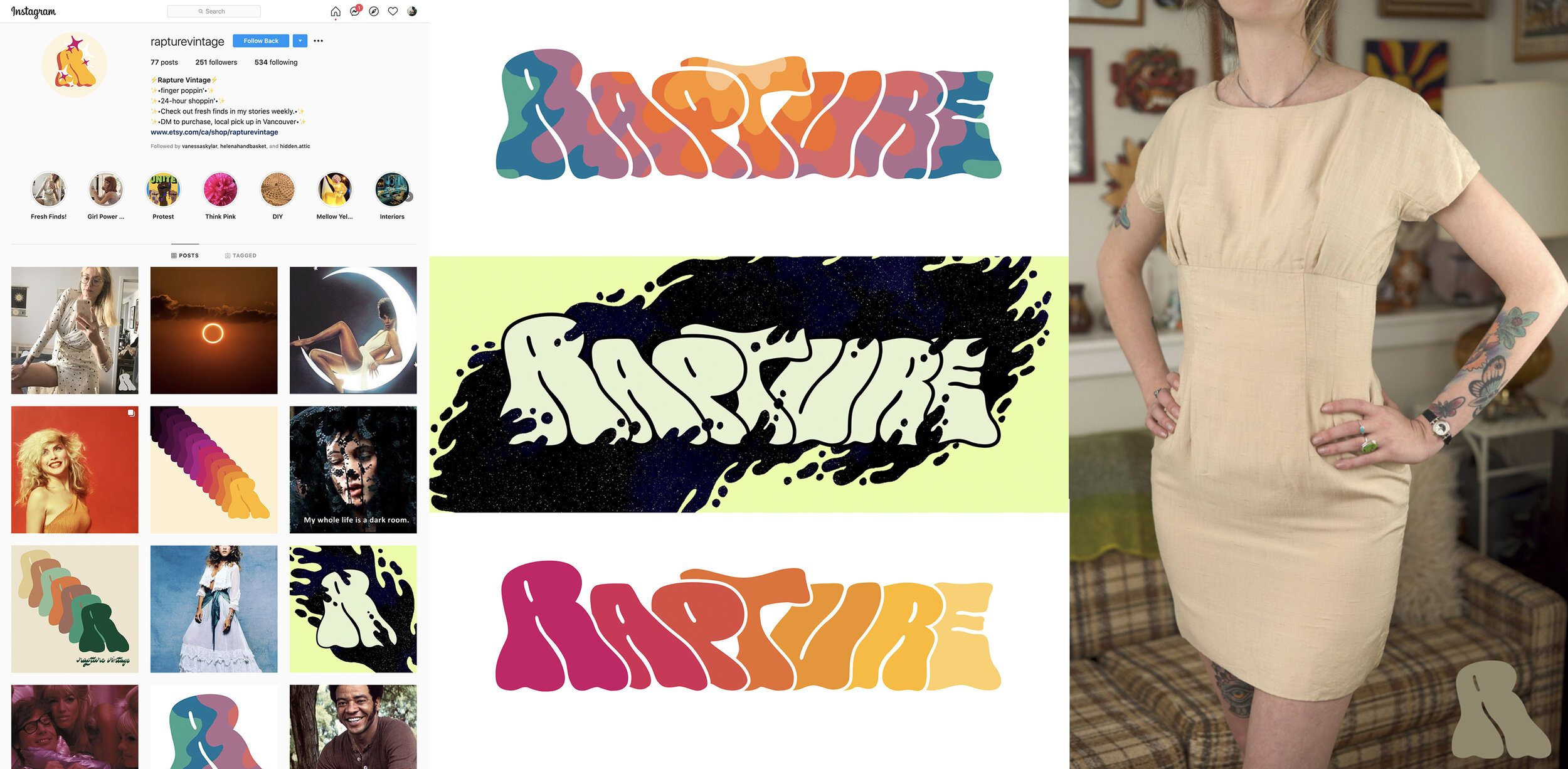
Rebranded social media mock-up (left) - Alternate shop banners (middle) - Product shot with watermarked mock-up (right - photo from Rapture Vintage)
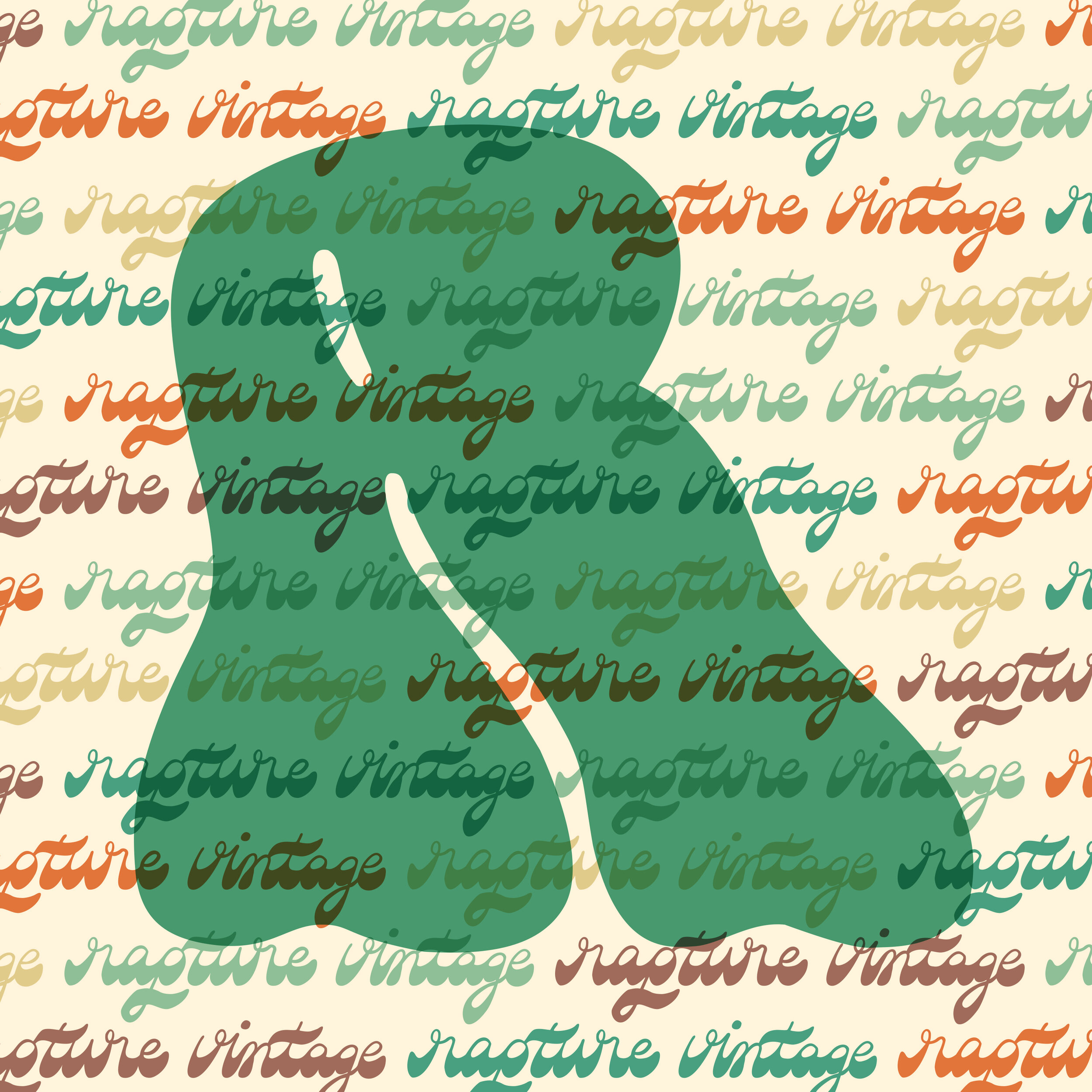
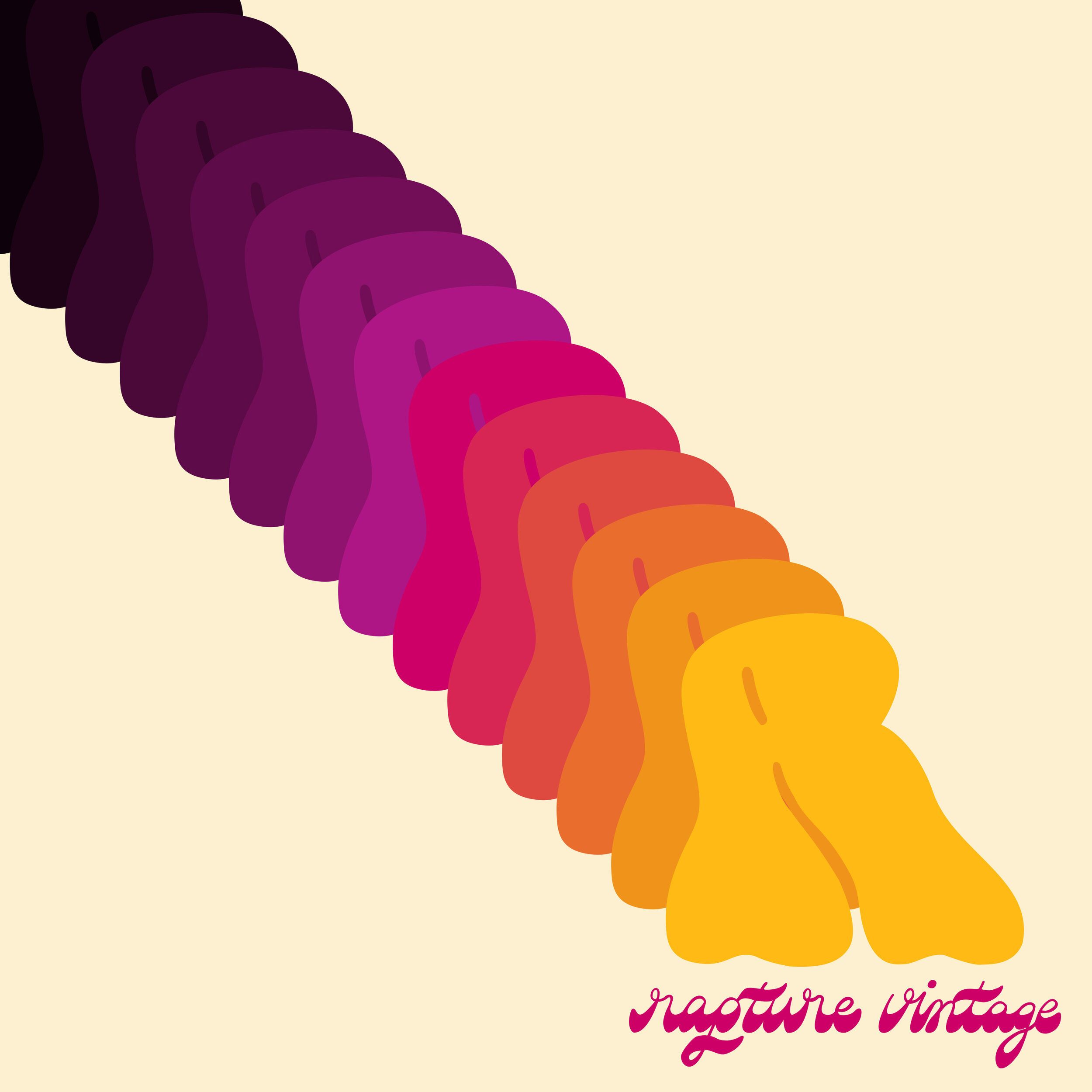
Additional promotional visuals

The C Word
A series of offensive greeting cards (carefully cropped here). Started in 2016, this line of cards for all occasions uses a combination of wordplay, shocking humour and cutting insults to bring a hardy laugh (or a sustained groan) to the special people in the lives of customers.
The cringe-worthy comedy is intentionally balanced by the overall design of the risograph print cards which feature cute characters and bright, simplified colour palettes to create a visually appealing and morally bankrupt experience.

Select cards from Series 1 (top left) - Spot illustration from limited holiday card release (bottom left) - Business card (right)


Design market display (top left) - Social media promotional material (top right) - Various spot illustrations (bottom)